Tuesday, April 29, 2008

The Age Of Information

1.Using chapter 20, define Swiss design or the International Typographic Style
International typographic style involved asymmetrical organization of the design elements on a mathematically constructed grid. It also involved objective photography and copy that in a way presented visual and verbal information in a clear and factual manner, that was also free from exaggerated claims of propaganda and commercial advertising. Sans-serif type that was set in a flush left and ragged-right margin configuration.

2. Place one image that you find to be interesting.
This is an ad for breast cancer


3. Using chapter 22, place one image that you find to be a successful corporate identity system.
This is of the Target logo


4. Using chapter 23, starting on page 402- define a psychedelic poster and place one image that you find to be an interesting example of it.
Psychedelic posters are posters that made statements about social viewpoints rather than commercial messages. It began in the 1960s---around that time, the civil rights movement, protests against the Vietnam War, and the women's liberation movement were occurring. The media and the general public related these posters to antiestablishment vales, rock music, and psychedelic drugs. Psychedelic artists used the flowing sinuous curves of art nouveau as one of its many resources. Psychedelic posters were vibrant in color and images from pop culture were recycled or manipulated. Letters were warped and bent to the edge of illegibility and were printed in complimentary colors. The example I found was actually from a bumper for Late Night With Conan O'Brien

Saturday, April 19, 2008

Kitsch and the Modern Movement in America

1.Define American Kitsch art (it's not in the book) it's also known as 50s art. Find 2 examples and place it in your blog.
Kitsch art was described as art that appealed to the lowbrow taste and the quality of it was considered "tacky". This example is from an Absolut Vodka ad


Here's another one.


2.Read pages 336-341, 344-350. Define what was going on when the modern art movement made it to America.
The modern art movement began in the 1930s. Around that time, immigration was at its highest, hence a lot of ideas from European graphic designers arrived in America too.

3.How was Tschichold's work seen in America?
When Tschichold's work "Elementare Typographie" was published in America, it caused "considerable excitement and turmoil". Editors and writers considered it as an "insane juggling of type by a band of crazy, foreign type anarchists". Some American designers, however, liked these new ideas and started incorporating it, including using Futura and Kabel type.

4.What Immigrants came to America?
Most immigrants that came to America in the 1930s were French and Russian.

5.Describe how poster looked in WWII.
Many of the posters used during WWII were inspired by people's intense feelings about Hitler, Pearl Harbor, and the war. The impact of their feelings was achieved by dramatic contrast of color and scale. Some also addressed the political and economic injustice of Nazi brutality.

6.Insert one of the Art work from the American artists that you find interesting at this time.
This image from the book I found interesting was done by Ben Shahn and it was a poster during WWII


sc

Thursday, April 17, 2008

Bauhaus and the New Typography

1.What did Jan Tschichold hope to accomplish with his book Die Neue Typographie (The New Typography).
Tschichold wanted to "wipe the slate clean" and find new asymmetrical typography to express the spirit, life, and visible sensibility of the day. He rejected decoration in favor of rational designs. He opposed of symmetry and favored uneven lines. He believed that sans-serifs were part of the modern type movement.

2.What was the importance of László Moholy-Nagy with photography?
He created the "typophoto" which is basically the integration of word and image to communicate a message. He believed that photography could influence poster design by using these techniques" enlargement, distortion, dropouts, double exposures,and montage. He would use his camera to take pictures from a worm's-eye, bird's-eye, extreme close-ups, and angled viewpoints instead of the normal viewpoint.

3. What were the importance of the typefaces Times New Roman, Futura and Universal Alphabet.
Futura was designed in Germany. It had 15 alphabets including 4 italics and it became the most widely used geometric sans-serif family. Times News Roman is a typeface that has short ascenders and descenders and sharp, small serifs. It appeared in one of the world's preeminent newspapers. Many readers liked the legibility and the clarity of it. It became one of the most widely used typefaces in the 20th century. For some reason ,I could not find anything in the book about Universal Alphabet. Maybe I overlooked it?

Monday, April 14, 2008

Class follow up 4/14, A new language of form, and Bauhaus

1. What was the most useful or meaningful thing you learned from the discussion?
It was quite interesting how the Dada movement was named by a person pulling out a dictionary and randomly choosing a word from a page. Especially since the Dada movement was very random.

2.What questions remain in your mind after today's discussion about the the modern art movements and Plakastil?
Right now I don't really have any questions. If I think of something, I'l just edit it out later. But I do like to point out that in class today, I didn't want to seem like a know it all but Vincent Van Gogh did not paint the paiting The Scream. It was done by an artist name Edvard Munch. I did say it wasn't Van Gogh, but I guess it wasn't loud enough.

Define Art Deco.
Art Deco is used to describe popular geometric works of the 1920s and 1930s. It's basically an extension of Art Nouveau. Some of its infulences include: cubism, Bauhaus, the Vienna Secession, Egyptian, Aztec, and Assyrian motifs. Some elements include: zig-zag, moderne, and decorative geometry. An example I found is the inside of Shaw's Oyster Bar in Chicago.

I really like the use of colors and the typography of this image.

Define Suprematism
Suprematism is a Russian form of art that took place inbetween WWI and the Russian Revolution. It was founded by an artist named Kasimir Malevich. It's a style of basic forms and pure color.He created a form of geometric abstraction that wasn't much like futurism and cubism. This form was new and non objective. He sought "a supreme expression of feeling, seeking no practical values, no ideas, no promised land" and rejected utilitarian function and pictorial representation. This piece is done by Malevich and it's title Suprematism no. 58

I like the colors and how the shapes are arranged in this compositions.
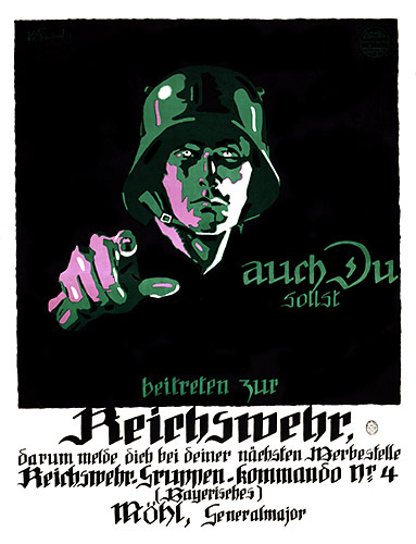
Define Constructivism.
Constructivism came from leftist artists opposing to the older and conservative visual art. They supported the Russian Revolution and by 1920, their art was to serve the new communist society. They renounced "art for art's sake". This poster was done by an artist named Aleksandr Rodchenko. I could not find the name of it tho.

I like the colors, the black and white photograph and the way the text is laid out so you can tell that she's shouting. It is also very similar to an album cover by Franz Ferdinand. Maybe they got the idea from this work?


Define De Stijl
The De Stijl movement started in the Netherlands in 1917. It is another form of abstract geometry and it sought universal laws of equilibrium and harmony for art. These artists only used primary colors (red, yellow, blue) and neutrals (black, gray, and white). They only used straight horizontal and vertical lines, and rectangles and squares. This image is titled Composition with Yellow, Blue, and Red by Piet Mondrian.

I like the geometry and its simplicity.

Define the Bauhaus style and place in your blog one piece of their work you find to be interesting
The Bauhaus is a German design school from 1919-1933. The Bauhaus style was created by the students enrolled in that school. Most works were inspired by expressionism. Johannes Itten, one of the instructors of the Bauhaus, wanted each student to release their creative abilities and to develop an understanding of the physical nature of materials.

Poster

Saturday, April 12, 2008

The Influence of Modern Art, Pictorial Modernism

1. Define Cubism. Find an example that is not in the book.
Cubism was influenced by African tribal art to the human figure. The figures were abstracted into geometric planes, and classical norms for the human figure are broken. Most of the time, figures are shown from more than one viewpoint.
Here is one example I found, I could not find out who painted it or what the title is.


2.Define Futurism. Find an example that is not in the book.
Futurism was started as a revolutionary movement by Italian poet Filippo Marinetti. It caused all the arts and forms to be tested against the new realities of scientific and industrial society. Futurism was described as if it would leap and burst right through the pages. Three or four colors were usually used while twenty typefaces were used. They were freed from tradition and typefaces were pasted in non linear forms. It would sometimes take the shape of objects or religious symbols. This image was done by Natalia Goncharova in 1913. The title is called Cyclist.


3.Define Dada. Find an example not in the book.
Dada began as a protest against the first world war. The graphic works included chance placement and absurd titles. Artistic acts were usually done by matters of individual decisions and selections. Freedom was definitely tested in this period. Dada artists have claimed to invent "photomontage" which is the technique of manipulating found images. This image was done by Raoul Hausmann.


4. Define Surrealism. Find an example not in the book.
Surrealism shares some of the same ideas in the Dada movement. It began in France in 1924, and artists were searching for the "more real than real world behind the real", which was the world of intuition, dreams, and the unconscious explored by Freud. Unlike Dada, which showed negativity, Surrealism showed a poetic faith in man and spirit. Artists expressed a great deal of symbolism and fantasty. This image is done by no other than Salvador Dali and the title is called The Persistence of Memory


5.Define Expressionism. Find an example not in the book.
Expressionism emerged in Germany before WWI. It was described as "the tendency to depict not objective reality but subjective emotions and personal responses to subjects and events". Color, drawing, and proportion were often at times exaggerated or distorted. Symbolism was seen as very important in this period. Thick paint, loose brushwork, and bold contour drawings were used a lot. Also, Line and color were very pronounced and color and value contrasts were intensified. This image I found is titled Inside by Joseph Minton


6.Define Plakastil.
Plakatstil (poster style) is described as the reductive, flat color design school that emerged in Germany in the early 20th century. One of the artists that paved the way was Lucian Bernhard. After running away from home, he entered in a poster contest. At first it was rejected, but one juror loved it and convinced the rest of the jurors to re consider. He basically paved the way for simplification and reduction of naturalism into a visual language for graphic communications.

7.Post a WWI poster for the Allied powers not in the book. Define what they were trying to do with this poster.

This poster was a Canadian poster. It basically encouraged Canadians to enlist and help fight the war.

8.Post a WWI poster for the Axis powers not in the book. Define what they were trying to do with this poster.

This was a German poster for WWI. It's encouraging soldiers to enlist and fight in the war. The way the German soldier is pointing is quite similar to the Uncle Sam poster (figure 14-27).

9.Post one work by AM Cassandre that you find monumental and explain why


I really like this one because i like how abstract the composition is and I like how the typography is cropped.

Wednesday, April 2, 2008

Class follow up 4/02

1. The most important thing I learned about in today's class was Ethel Reed, the first woman graphic designer. It kind of helped pave the way for someone like me to be able to get a job in graphic design. It's too bad that she dropped out of historical records.

2. As far as I know right now, I really don't have any questions.